Archive
Social Media Marketing Checklist – JWTIntelligence video
I recently highlighted a fine video by JWTIntelligence on Key Trends for 2011, and commented that it was a great example of the use of video to illuminate and educate.
Well here’s another brief video from JWT providing actionable Social Media Marketing recommendations for brands, from July 2010:
Again, very well done.
glenn
10 Trends for 2011 – great 2 min video from JWTIntelligence
I’m a big fan of JWTIntelligence‘s brief videos that visually explain key trends. Their Top 10 Trends for 2010 was a brilliant example of visual storytelling. And their Top Trends for 2011 in 2 minutes video is equally impressive:
A very nice example of the use of video to illuminate and educate.
glenn
Epipheo Studios – brilliant use of visual thinking applied to video
A few weeks back I stumbled across this really cool video that illustrated the essence of the value proposition behind a semantic technology company called Metaweb (recently acquired by Google). When I first saw the video, I thought “Wow, what a great use of visual thinking to explain an underlying concept!”
Well, it turns out this video was one of many created by a company called Epipheo Studios. Epipheo, BTW, is short for “Epiphanies on Video”. Say what? Well, here’s how Epipheo tells the story:
As explained in the video, an Epipheo explains and enlightens, it explains new concepts and ideas in a simple and original way. If we are inspired and stimulated by the experience, we are likely to want to share it with others we feel might be interested. And if they are enlightened or inspired, they will share it with others too. And so on.
Oh, and it may also be an advertisement for a company or product. But if you learn something new, if it helps new ideas and concepts form in your mind, if it leads to an “epiphany”, you may not even notice. And you are unlikely to find the experience “intrusive”.
I love it. Here’s another video from Epipheo that I really liked, that explains Facebook’s Social Plugins:
To see other Epipheos, click here to see their entire portfolio of videos.
glenn
Luke Wroblewski on Parti (or the main idea) from Interaction09
Luke Wroblewski, former Chief Design Architect (VP) at Yahoo! delivered a very provocative presentation at Interaction09 titled Parti and the Design Sandwich. The talk focuses on 2 main themes:
- The notion of Parti (also referred to as “the Big Idea”, which Wikipedia defines as the chief organizing thought or decision behind an architect’s design presented in the form of a basic diagram and/or a simple statement
- The Design Sandwich – which Wroblewski says “is really the way that we can make informed decisions that help us deliver on this big idea, this parti.”
His talk borrows heavily from the book 101 Things I Learned in Architecture School, by architect Matthew Frederick.
Furthermore, Wroblewski approaches the concept of parti not from the vantage point of a traditional architect, but from the perspective of someone who architects digital spaces in the role of an Interaction Designer.
The video is displayed below:
The presentation slides accompanying the video can be found here.
I have to say that this notion of parti presented by Wroblewski has really influenced my thinking around modeling and explaining complex spaces lately – as a way to rise above the detail to get to the “essence of the thing”, in a simple and visual form.
Anyway, the rest of this post explores some of the key messages delivered by Wroblewski in his presentation.
Introducing the concept of Parti – or “the Big Idea”
OK, so what is this Parti notion? I mentioned above that Wikipedia defines parti as “the chief organizing thought or decision behind an architect’s design presented in the form of a basic diagram and/or a simple statement“.
Wroblewski quotes Frederick who defines parti as “the central idea or concept of a building“. Here’s the presentation slide:
Parti is much more than just a concept. Says Wroblewski:
The interesting notion behind that is it’s the Big Idea behind a structure. So a structure in the architect’s world could be a building. A structure in the Interaction Designer’s world could be something different.
And in particular, what makes this a little bit different than what traditionally people talk about as product vision, or a mission statement, or a core idea, is the way Fredrick outlines how architects depict this and work through this, in which he says “It’s expressed as a diagram that depicts the overall organization or the overall structure of something. But at the same time really points to experientially or aesthetically what’s the theme of it. How does it roll up together.
And I think this is where that distinction really falls, which is that there’s almost a design artifact this product vision, this big concept – which isn’t necessarily the case when you get some sort of thing coming from someone on the business side or the product management side – that’s a statement right, here’s our vision statement – “we’ll be #1 in 5 years”. It’s a very different kind of articulation of where you’re trying to go.
And particularly the things that really resonated for me is this concept of the small diagram representing the big idea, and its organization and experiential sensibility. I thought that was cool.
Frederick presents examples in his book that illustrate this core concept of a building in a simple and straightforward way. Here’s the slide Wroblewski presents:
Here’s Wroblewski’s comments on Frederick’s illustrations:
So if you look at this “odd shapes intrude on a pure space”, you kind of get a sense of how that might feel, you get a sense of what the core idea is of the building, and how it might manifest itself.
Or “L’s in conflict” – there’s kind of a tension there, you can sort of begin to think about what that might feel like, and how that might act.
I do think that even these simple diagrams – especially the odd shapes and L’s in conflict – they do depict the general floor plan for the building, but they do have an aesthetic or an experiential sensibility. You start to get a sense of how they might actually engage you on an emotional level versus just a functional level. Functional level, it’s like “oh, I can put my office in here”. Emotional level, you might start to think about how you’d actually feel working in that space, the kind of mood it creates, and so forth.
Applying the Parti concept to the redesign of the Yahoo! homepage
Wroblewski then proceeds to discuss how this notion of parti can be applied to his recent work (in early 2009) redesigning the Yahoo.com homepage. I’m not going to elaborate on his discussion around the redesign of Yahoo.com’s homepage. If you are interested, please view the video.
A Parti must reflect its environmental forces
However, I will briefly address some broader concerns that Frederick discusses in his book around applying the parti concept. And the first is that a Parti is deeply related to its environmental context, which is inevitably shaped by several forces. This is illustrated in Wroblewski’s slide below:
On the one hand, this is very reminiscent of the notion of forces applied to architectural design patterns in the manner that Christopher Alexander discusses.
However, I appreciate the reminder that the “core concept”, and the “essential structure and aesthetic design” of “the thing”, must also reflect, and be an expression of, the fundamental forces to which it is subject to in its environment and usage.
A Parti diagram will address the essential concerns for a project in a holistic way
Wroblewski quotes Frederick:
A parti diagram can focus on any specific aspect of architecture that it defines. It could be massing, spatial hierarchy, site relationship, core location, interior circulation, public/private zoning, solidity, transparency, and so on and so forth.
Wroblewski then adds:
But not every little diagram covers all those sorts of things. So if there’s something that’s really defined by its core location or there’s something that’s really defined by its spatial hierarchy, that’s the center point of the little parti diagram.
The key message here is that a Parti diagram will address the most essential forces or factors acting on the design, and it will address those factors in a holistic way.
The Design Sandwich – Using the Parti concept to help guide Design Decisions
In the second part of Wroblewski’s presentation, he discusses how design decisions should reinforce the core concept of the design (i.e. the parti). This perspective is shared by Frederick, as presented in the slide below:
The Design Sandwich
The Design Sandwich is a conceptual framework developed by Wroblewski to provide a framework for making good design decisions that align to the parti (or the big concept or idea) underlying the design. Here’s how Wroblewski describes it:
The Design Sandwich is really the way that we can make informed decisions that help us deliver on this big idea, this parti.
So without further ado, here’s what the Design Sandwich looks like:
Wroblewski describes the different elements of the Design Sandwich as follows:
Design Principles
And at the very top is this notion of Design Principles. And Design Principles, as I’ve laid it out here, are really filters we’re going to use to see if the decisions we’re making line up with that central concept. So if this is a guidepost, a thing to use to evaluate where we’re going, these are the sort of checklists, or high-level principles that we’re going to use to see if we’re going towards it, or if we’re going away from it. And if we’re going away from it, we should probably change what we’re doing.
Design Considerations
At the bottom, you have what I call Design Considerations. These are the factors you weigh when you consider what design decision you’re going to make, what solution you’re going to go with. It could be the environment, the technology, skill level of people, the domain, goals, needs, existing workflows, so on and so forth. There’s this whole slew of things we have to think about when we choose between even simple things like interaction elements.
Patterns and Best Practices
Luckily there’s ways that we can make some informed decisions out of those considerations. And one of the most common ones that people talk about in interaction design circles is Patterns and Best Practices.
Testing
So the other set of informed considerations that we get is by Testing.
Design Decisions
And that’s sort of my middle-of-the-sandwich composite, which is this is where we make Design Decisions, right? We go from looking at all these opportunities and limitations, and all this different context and things we have to consider when we decide what to do with a specific aspect of the design. We can test some of that. We can turn to Patterns or Best Practices for some of that. But across the whole board we have to make decisions.
And why do I focus on decisions so much? And why is this sort of the whole “meat” of this sandwich?
Well two things. One is I care a lot about how Design Decisions get made because I see a lot of decision-making squandered to org chart. I see a lot of decisions squandered to who screams the loudest. I see a lot of decisions squandered to things we’ve done before, or things that are out of context, or things that don’t relate to the project we’re doing.
Applying the Design Sandwich – Case Study
Wroblewski then gives a couple of examples of how the Design Sandwich can be applied to organizing a couple of design books that his group at Yahoo! had recently published. The slide below shows how Key Considerations, support Key Principles, support the overall parti – “Fast and Effective Web Forms” – of Wroblewski’s book Web Form Design:
A Parti is subject to change
Wroblewski concludes his talk with a final, powerful message – that the overall coherence and integrity of a parti is subject to change over time. The slides below quoting Frederick really say it all:
And:
In Summary
So here’s the summary slide for the talk.
A truly wonderful and inspiring presentation.
glenn
Gamestorming – XPLANE’s Dave Gray talks about his new book
Dave Gray of XPLANE has a new book out titled Gamestorming: A Playbook for Innovators, Rulebreakers, and Changemakers – a book that he has co-authored with Sunni Brown and James Macanufo.
Gamestorming is a book about creating an environment for creativity and innovation in organizations through playing team-oriented games. I currently have the book on order, so I can write about it yet. But here’s the blog that inspired the book. And here’s a wonderful video of Dave Gray at IxD10 presenting the ideas that motivate the book:
There is one segment of the video that I particularly like, starting around 26:40 – and it’s on the topic of Artifacts. Here’s Dave Gray:
What is an Artifact? Usually an artifact is something we find in an archeological dig. … But artifacts are usually portable, as opposed to the Parthenon. An artifact is usually something that people have imbued with meaning of some kind and we may or may not know what is it. But it’s an object that has meaning to people, that meant something, and they used it to carry meaning around, like we do with our laptops or books.
So what Artifacts do for us in knowledge games, is artifacts give us a way to make information tangible, so we can put our meaning into motion and make it portable.
So when you’re trying to have a meeting, and all the stuff is just floating around in the air and people are just talking about it and there are no tangible artifacts … you’re expecting everyone to hold all this information in their head, and it’s very hard [for people] to actually think what they want to do with this information, when they’re just trying to track it.
In a nutshell, artifacts “anchor” meaning so that it’s tangible, explicit and can be communicated/shared.
I’ll update this post once I’ve had a chance to read the book.
glenn
Visual Thinking in Business – an update
Introduction
It’s been a while since I dedicated a post to visual thinking – September 2009 in fact. In this post, I introduced a handful of visual thinkers that have inspired me, including Scott McCloud, Dave Gray, Dan Roam, and Nancy Duarte.
In a post yesterday, I reviewed the wickedly-cool book Business Model Generation, by Alexander Osterwalder and a team of practitioners, that makes very heavy use of visual thinking.
Since yesterday I’ve come across a few additional visual thinkers, and visual thinking companies, that I’d like to introduce. So here goes.
Visual Thinkers applying their craft to the business world
JAM
First up, Dutch company JAM, who like Xplane, brand themselves as a visual thinking company. Here’s how they work (in pictures of course):
In other words, they help businesses and organizations understand, tell, and communicate important stories about what they do, why they do it, and how they do it. JAM worked as visual story consultants on the Generating Business Models book.
David Sibbet
David Sibbet is the author of the recently-released Visual Meetings: How Graphics, Sticky Notes and Idea Mapping Can Transform Group Productivity. He speaks about his approach in this TEDx talk in January 2010. There’s another nice short video by Sibbet that uses visual thinking to illustrate some fairly sophisticated ideas around team dynamics and performance here:
Big Picture
Lastly, give it up for Danish-company Big Picture. Here’s how they illustrate the essence of their approach:

Note the basic steps of (i) a problem to be solved, (ii) ideation and understanding of the problem, (iii) designing a plan, and (iv) communicating and execution on the plan. Simple, heh? 🙂
Tablets, the iPad, and Visual Thinking
David Sibbet comments in one of his videos, and it’s a sentiment I’ve heard expressed frequently, that the introduction of tablets, and the iPad specifically, promises to be a game-changer for introducing visual thinking into organizations. I think the sentiment is pretty well captured in this blog post, Is the iPad the ultimate tool for visual thinking?
In Conclusion …
Well, that’s all for now. Just wanted to share some recent discoveries I’ve made around leading visual thinking practitioners. And it’s such a hot field, that I’m sure there are hundreds of other thinkers/organizations that I’ve yet to stumble across. But I’ll keep you posted on what I discover.
glenn
Business Model Innovation – Alexander Osterwalder
Business Model Generation – Introduction
Introduction
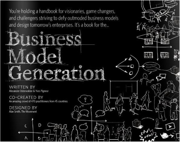
So I recently came across a book on Amazon that immediately piqued my interest. That book is Business Model Generation, by Alexander Osterwalder. This is one of the most unique and interesting books and approaches I’ve come across in a long while. Here’s the front cover of the book:
Business Model Generation is a recent addition to the long line of books on business model innovation in the face of disruptive business change. Geoffrey Moore, Clayton Christensen, Michael Porter, the Balanced Scorecard and Strategy Maps, and others are part of this long tradition. But this book is very special IMO. And the primary reason for its uniqueness is its use of visual thinking.
I’ve long been a fan of using visual thinking to tell stories and convey meaning. Scott McCloud, Dave Gray of XPLANE (now part of the Dachis Group), Dan Roam, Dion Hinchcliffe, Nancy Duarte, Garr Reynolds, and the entire VizThink community have been some of my primary influences. Now I would definitely include Alexander Osterwalder at the top of this list.
Basic Premise of the Book
There are several important premises that underlie this book, IMO (Edit Aug 2/10: Having nearly finished reading the book, I would definitely now update this list. In fact, I will be updating this entire blog post. Will do that over the next day or two.). They are:
- The scale and speed with which innovative business models are transforming industrial landscapes today is unprecedented
- Designing new business models is extremely difficult
- It is important to be able to describe and communicate a business model in clear, concise, and simple way – and this best way to do this is through visual thinking and communication
- Having a formal method, and a common vocabulary, to describe, collaboratively design, and communicate business models is critical
- Structured, visual models are an important link in bridging strategy and execution
That’s it I think. Those are really the key premises underlying the book. Note that this is just a list I put together, and you won’t find this list specifically in the book. But I think it’s pretty close to the mark.
Business Model Canvas
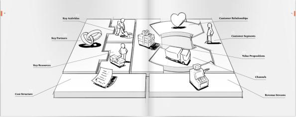
The Business Model Canvas is the core framework presented in the book for describing and generating new business models. This framework is illustrated in the picture below from the book.
It’s a bit hard to see without clicking on the above picture to enlarge it, but Business Model Canvas has 9 key inter-locking pieces – or building blocks – that, taken together, can describe any business model. These 9 building blocks are:
- The value proposition of what is offered to the market
- The segment(s) of clients that are addressed by the value proposition
- The communication and distribution channels to reach clients and offer them the value proposition
- The relationships established with clients
- The key resources needed to make the business model possible
- The key activities necessary to implement the business model
- The key partners and their motivations to participate in the business model
- The revenue streams generated by the business model (constituting the revenue model)
- The cost structure resulting from the business model
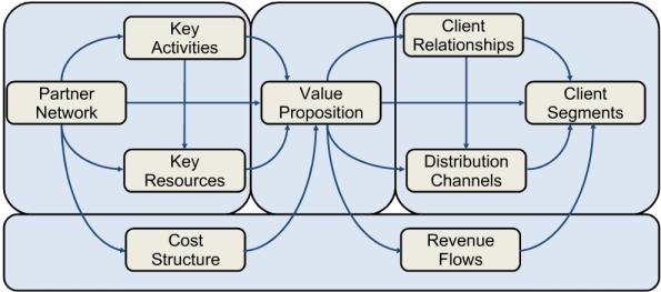
The book covers each of these pieces in some detail. But these “pieces” are not just a list of isolated components. They come together in an inter-locking framework that is illustrated below.
For design geeks out there, here’s a highly interesting and entertaining view of the structure and design of the book – focusing on the Business Model Canvas section – by the book’s Creative Director Alan Smith:
For Smith’s commentary on the design of the Business Model Patterns section, click here.
Working with the Business Model Canvas
When using the Business Model Canvas in a collaborative setting, participants typically work on a wall poster that is organized as shown below:
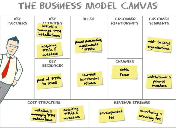
But the gold in the Business Model Canvas comes from the collaborative discussions and explorations in trying to envision new business models. Typically as mentioned above, participants will work with a wall-sized version of the post, and use post-it notes to flesh out either an existing business model, or possibilities for a new business model. Here’s a simplified version of a possible business model in the solar industry:
This example is not actually from the book, from from Osterwalder’s presentation A Business Model for Solar Energy.
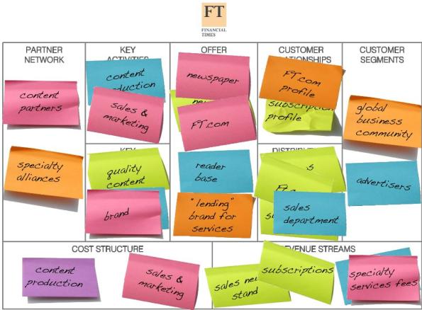
In the ideation phase, this process will be messy, messy. Much messier, for instance, than this highly-simplified model of the Financial Times business model:
And that’s a good thing. 🙂
Using Visual Thinking techniques to illustrate Business Models
Example – Sellaband
Using Post-it notes is a quick and easy way to throw out ideas, and be able to easily and quick move them around on a canvas. However, as Osterwalder discusses in the Design section of his book, Visual Thinking and pictures can convey meaning and relationships in a way that text simply can’t.
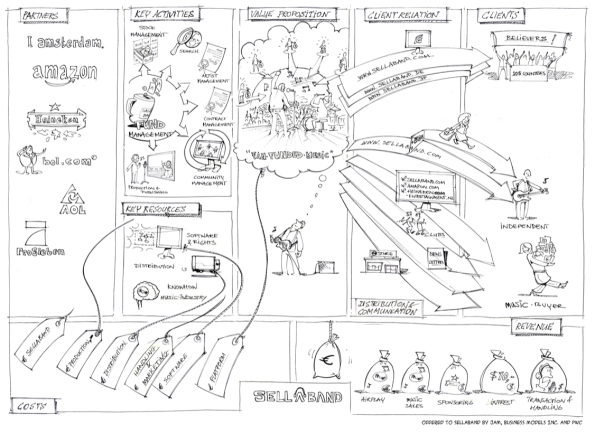
As an example, here’s a sketch that JAM did for a young Dutch company Sellaband, that was looking to envision a completely new business model in the music industry – a platform enabling crowd-funding of independent music artists:
Of course, there are numerous subtleties in this diagram that would have been addressed in ideation process, which would require significant elaboration. But that’s the point of the diagram, to simplify the business model to a single picture, that provides a high-level overview of its most fundamental elements.
Additionally, Sellaband created the visual to develop a shared understanding, and to pitch their business model to potential investors. So they would be in a position to elaborate on the visuals in face-to-face meetings.
Telling the Story
The book advises that a powerful way to explain a business model is to tell the story “one image at a time”. It cautions:
Presenting a full description within the Business Model Canvas can overwhelm an audience. It’s better to introduce the model piece by piece … It allows the audience to follow the build-up of the model, and the visuals complement your explanation.
The book describes the 4 steps in telling a visual story as:
- Map your business model
- Draw each business model element
- Define the storyline
- Tell the story
The value of Visual Thinking
Osterwalder elaborates on the value of visual thinking in working with business models:
Visual thinking is indispensable to working with business models. … Because business models are complex concepts composed of various building blocks and their interrelationships, it is difficult to truly understand a model without sketching it out.
A business model really is a system where one element influences the other; it only makes sense as a whole. Capturing that big picture without visualizing it is difficult. In fact, by visually depicting a business model, one turns its tacit assumptions into explicit information.
In summary, visual thinking brings a clarity and coherence to the complex set of elements and relationships inherent in a business model in a way that textual description simply can’t.
Hearing it straight from the Horses mouth …
All well and fine, but it’s always nice to hear someone speak about their approach in person. Probably the best video of Osterwalder presenting his approach is the video below:
The slide deck accompanying this presentation can be found here. Here’s another presentation Osterwalder gave on Business Model Innovation in Melbourne in 2008, with the accompanying slides available here.
Hope you find the approach as compelling as I do.
glenn
Matt Webb on Design and Culture
Really enjoyed the video of Designer Mark Webb speaking at Reboot 11 in Copenhagen in June 2009, that was brought to my attention in a Leisa Reichelt blog post. Here’s the video:
Vodpod videos no longer available.A few gems of insight.
The first is the notion of what Designer John Thakara, in his book Inside the Bubble: Designing in a Complex World, calls a macroscope. Quoting Thakara:
A macroscope … is something that helps us see what the aggregation of many small actions looks like when added together.
Mark Webb elaborates:
Scientists have microscopes. Astonomers have telescopes. Designers, in order to see the very big, in order to see culture – which is bigger than any one of us individually – have macroscopes.
The way I think of a macroscope, is it’s something that shows you where you are, and where you are in the big context, simultaneously. So you can comprehend something much vaster than you in a human way, at human scale, in your heart.
I found a wonderful example of a “macroscopic” perspective from Ze Frank – a brief 4-minute video on the history of US involvement in Afghanistan. I don’t completely agree with his narrative, but it’s a wonderful visual communication of the “big picture” – i.e. a macroscopic lens:
Vodpod videos no longer available.The second wonderful insight starts off with a quote from, again, Ze Frank:
Over the last 20 years, the cost of tools related to authorship of media has plummeted. … When people starting learning something new, they perceive the world around them differently. … As more and more people have access to things like iMovie, they begin to understand the manipulative power of editing. Watching Reality TV becomes almost a game, as you try to second guess how the editor is trying to manipulate you.
Adds Webb:
Look, everytime someone tries to take into their own hands the tools of production, it’s like they’ve eaten a macroscope. They see and feel the world in context. They’re able not just to consume, but to produce, to invent culture.
… So I say our decisions about culture at large … are written in personal ability to weild the tools of production.
Very provocative stuff.
glenn
Nice application of Visual Thinking – Salesforce.com and Cloud Computing
A very nice use of visual thinking to market the value of Cloud Computing to business executives – from Salesforce.com.
glenn
Video: How Google Chrome inspired an O/S – fantastic visual communication
A very nice example of visual communication, telling the story of how the Google Chrome web browser inspired the Chrome O/S:
glenn


